JIWATT
Mobile app and landing page UI design for online fitness solution
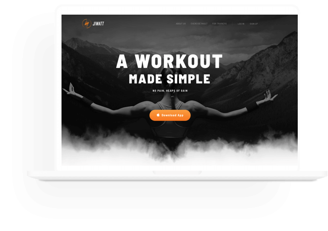
Jiwatt is a mobile application for iOS that helps people involved in sports keep a record of their training and select a schedule of classes and exercises, depending on the desired result.
Kultprosvet was approached by Sergey Lukashenko, COO of a Tokyo-based start-up, with a request to develop UI/UX for the product landing page. And we readily helped him.
The main task of our UI/UX specialist was to create a design matching the values of the company, which inspired one to take care of oneself and showed how convenient it was to work with the Jiwatt application. The purpose of the landing page was to interest the visitors so that they could download the application and start using it. It all began with joint brainstorming sessions, during which various options were suggested, down to the choice of the icon style and the shade color.
I am skeptical about the colored picture icons. They look too cartoonish and would stand out too much against the backdrop of a more or less serious style... Uncluttered outline icons are currently on trend, and they fit perfectly into the concept of our application
Misha, UI/UX Designer
Home page animation
Nike use colored photos because they need to show their products at their best. In our case, the product is an application,
Misha, UI/UX Designer
When Misha completed his work on the design, he was asked to develop the product logo, as well as labels for sports equipment. At this stage, we could take the liberty of working in a startup mode. Sergey and Misha were on the same wavelength, so we did not waste our time on “processes”: coordination of the TS, documentation bureaucracy, show-off presentations. The customer fully trusted Misha, and Misha understood the customer’s expectations without extra words. And this is the outcome:
Branding guidelines
In the future, it is planned to develop and implement an Exercise Vault, available both in the browser and in the Jiwatt application.
